London Business School x Women in Business x STORMBRANDS
5-minute read, by Lottie, Marketing + Development Manager
London Business School’s student organisation Women in Business launches a new brand, including reintroducing the club’s annual conference as Equall. The rebrand reflects its mission to support gender inclusivity and opportunities for all.
Building an equal future in business
Women in Business began in 2000 as a club for the prestigious MBA programme at the London Business School, one of the world’s most respected business schools, with 45,000 alumni working across 155 countries.
Women in Business is now a leading MBA club in Europe and its annual conference drives the progression of diversity and inclusion in business. This year marks its 20th anniversary, and to look ahead to the next twenty years of disrupting the business industry and inspiring the next generation of leaders, Women in Business needed a flexible, more inclusive, gender-neutral brand where everybody is welcome.
The new brand brings together both the members club and conference with one unified goal; equality for all. While the club retains the heritage of its name at the school, it launches a new annual conference, Equall and a refreshed identity to reflect its new purpose. The conference plays an important role for the club as a platform to reach the wider business community and drive change.
“LBS is at the top end of professional education. With that comes a responsibility to lead on issues affecting women and other genders within business. It was important that we found a design agency that shares our values and purpose, and StormBrands fully believes in our cause and ambition to grow. We knew they were the right fit for this project.” says Kanupriya Rungta, Club Co-ordinator, Women in Business.
“There is a serious problem in our industry with gender imbalance, particularly in the representation of women in senior roles. We feel strongly that this should be addressed and getting involved in this project has enabled us to contribute to positive change. Women in Business inspires and supports the next generation of business leaders – and creates a nurturing support base for kindness and mentorship,” says Jonny Westcar, Managing Director of STORMBRANDS.
Framing the Conversation
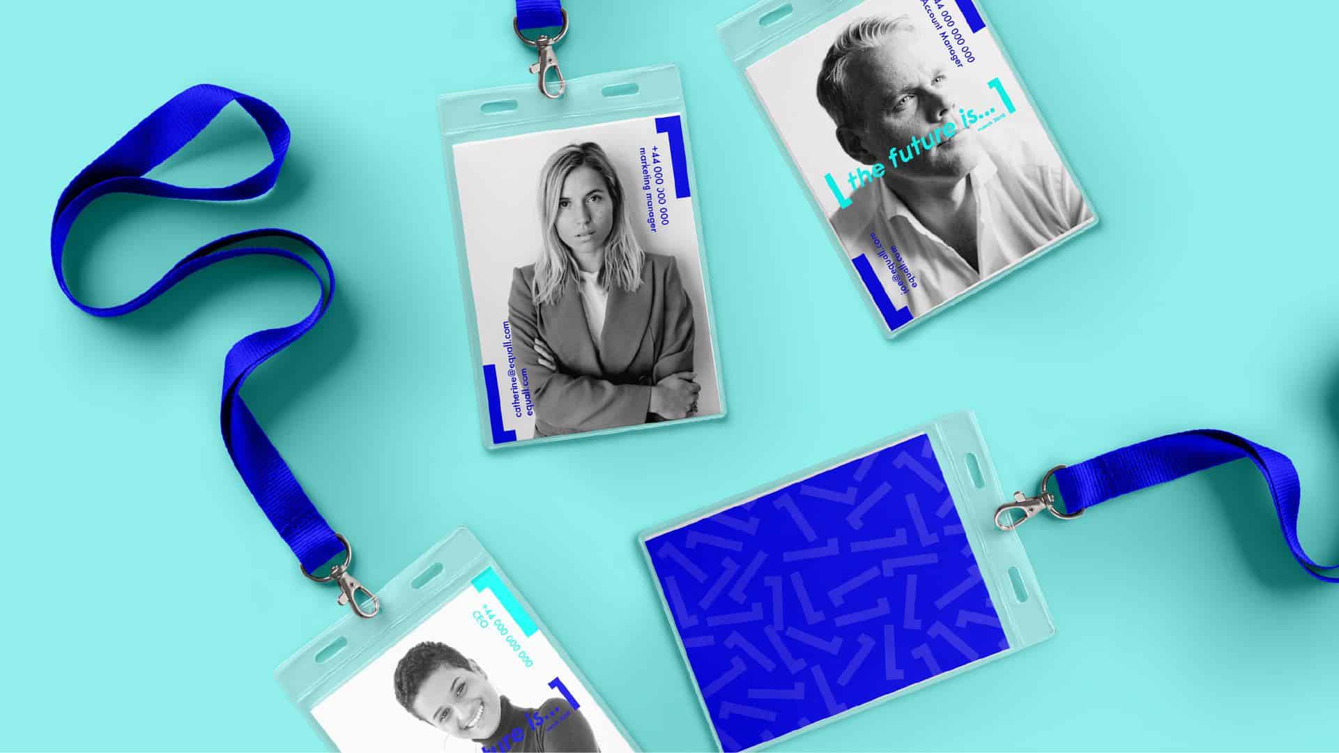
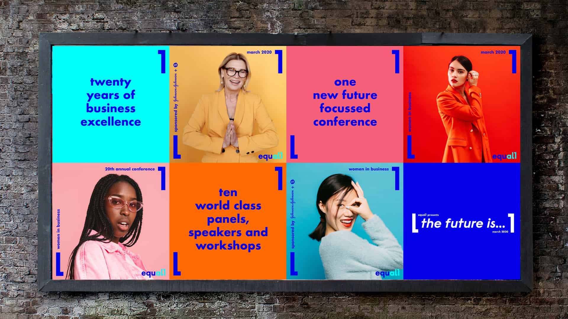
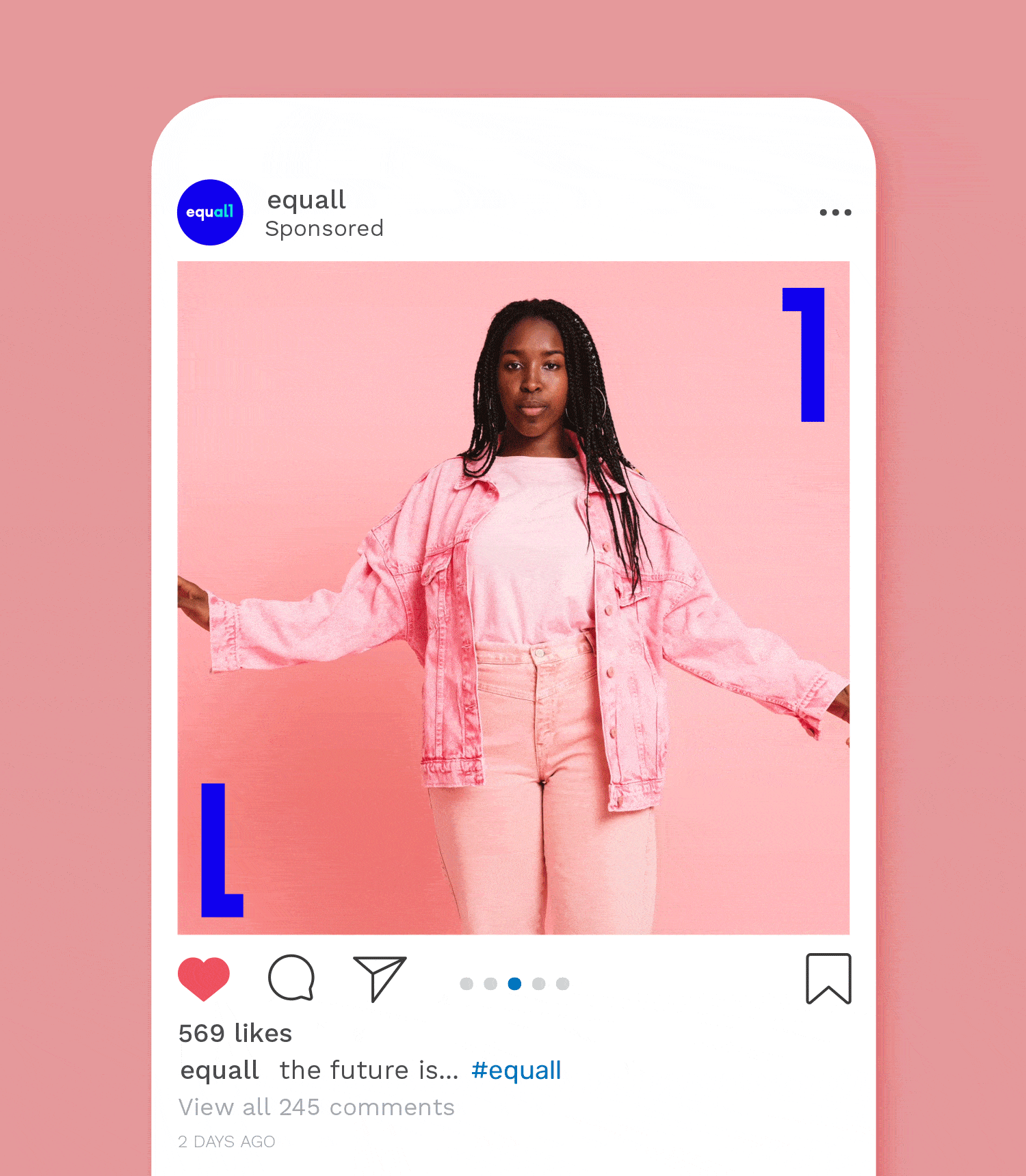
The previous logo and identity felt corporate and restrictive, and the update needed to feel contemporary and progressive to match the organisation’s values and vision. The rebrand also needed to be adaptable and flexible for future growth. STORMBRANDS worked on all elements of the brand identity – from the logo itself to the website and photography guide, all pulled together with the defined strategy into a future-focused brand toolkit. Key to the refreshed brand are the bold, bright colours.
“Diversity should be celebrated. Pops of colour help tell the stories and communicate optimism. Electric blue is the dominant colour, which brings energy and dynamism to a brand that felt static. It was important to have maximum vibrancy and pace while still being legible, clear and professional”, says Gabriella Corbett, Graphic Designer at STORMBRANDS.
The logo also has an illustrative quality. The logo frame device acts as a visual metaphor for ‘framing the conversation and breaking boundaries.’
Sign up to our mailing list in the footer to receive more insights straight into your inbox, or follow us on Instagram or LinkedIn.